Showing posts with label complementary colors lesson. Show all posts

11.16.2011

Explore Art Projects: Pop Art Turkey Hand Prints

Today we are going to talk about Pop Art, Andy Warhol and Hand Print Turkeys. Oh My!

We discussed Pop art is the Jasper John's alphabet collage project.  For a refresher pop art is an art movement that gained popularity in the 1960's.  It used famous, recognizable images of mass media, advertising to make art.  It redefined and questioned what is art.

Pop art is such a fun art movement to look at and discuss with children.  Not only do they both ask why alot, but children will be engaged by recognizing images, how they play with images and color often used in Pop art.
Andy Warhol is one of the most well known American Pop artists, notably for his Campbell soup cans and portraits.  He continually played with the idea of repeating and reproducing the same image.


Warhol in his early career worked with a blotted line technique, creating an image on one side of the paper and then folding it in half to reproduce it on the other side.  He later started working with silk screening, rolling ink across to get the same image but just slightly different every time.

Warhol's Marilyn Monroe portraits used the silk screening process.  Here's a few questions to pose when discussing this image with your child.  Look at how the image, portrait of Marilyn is repeated.  How does he use color in the painting?  What kind of color did he use? What do you think of these portraits?


Here's a worksheet I used with my Explore Art Class, containing the images used above along with some ideas for discussion:


Turkey Time:
Now on to today's project: Pop art/ Andy Warhol inspired Turkey Hand Prints.  I did this project with Cy and the Explore Art class, the kids were really into it as they are getting ready for thanksgiving.  This is also something most of them have done before either in school or at home.  They were comfortable with the project and open to learning more about our featured artist and how we were going to make Pop art.


Materials:
  • Colored Paper
  • Washable Paint
  • Crayons
  • Accessories of your choice ex. feathers, googly eyes
We started with a Complementary Color Lesson, which was part of last week's post.  See both the Complementary Color Lesson post and how we put this to use with hand prints in the Complementary Hand print/ Thankful Tree post.  If you're working with a younger child or don't have time for the color theory lesson just let them pick what ever color hand prints that want!

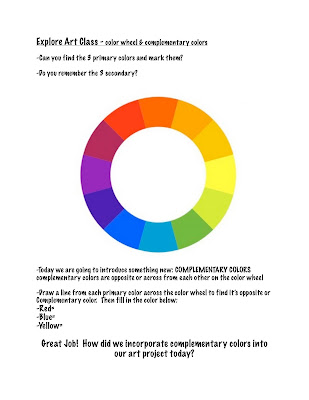
Here's the worksheet we used in class:
You need at least 4 paint stamped hand prints on the same size square paper.  Keep with an even number 4, 6 or 8 to get the grid look like Andy Warhol's portrait painting.

Relating this project to Pop art talk with your child about using bright, non traditional colors like Andy Warhol did and how you are repeating the image, hand print just like he did in his art. 

Once your hand prints have had enough time to dry it's time to make them into turkeys!  I didn't give too much instruction at this point.  Let the kids figure it out, have fun and explore in their own way.  I provided feathers which we cut down to be about the size of their fingers, crayons and googly eyes.  Elmer's glue assembled everything.

There you go!  Everyone had fun making beaks, waddles, feet and gluing on eyes and feathers.  They didn't necessarily have all the turkeys match but that is the fun of it.  And just like Warhol's work each one in slightly different. 

Stop back for Friday's Art Finds for more great Turkey Project Ideas I've found on other blogs.

11.09.2011

Explore Art Projects: Complementary Hand Prints/ Thankful Tree

Today's post is Part II of Complementary Colors.  Make sure and read Part I for a brief overview of the color wheel and complementary colors.

Complementary Handprints
For an art project to incorporate complementary colors I had Cy make handprints.  We used four different colors of paper, red, blue, green and purple.  If I did this project again I'd use only the 3 primary colors for paper.


I explained to Cy what complementary colors were, the colors opposite of each other on the color wheel, while we looked at a color wheel.  I picked a color and asked him to find the opposite color or complementary color on the color wheel.  Then we moved on to the paper.  I got out the paint we were going to use and laid out all the pieces of paper.  


Cy then had to find the complementary color in paint for each piece of paper.  He lined them up getting ready to make our hand prints.


I actually painted Cy's hand with a wide brush to then let him print it on the paper.  Only in part because his washable paints were running too low to pour out on a plate and let him smoosh his hands in.  Similar to finger painting this is a great hands on art experience!

He got a few hand prints on each piece of paper and we set them aside to dry.

Thankful Tree
I wanted to do something with these complementary hand prints to extend the lesson and fun.  What better than a Thankful Tree with the handprints as the leaves.  (now my husband might disagree because the tree landed roots in our living room)

Taking a roll of the brown packaging paper I unrolled enough to trace Cy's body laying down.  He was the actual tree.  He laid down and extended his arms up just like branches. (that is the dog in the corner wondering what in the world are we doing)

I traced him and then went back in for some tree bark details, running lines throughout the tree.  And cut it out.  Cy picked a corner of the living room and up went the tree with a little tape.

With the tree up we went back to the complementary hand prints, cutting each one out to then be our leaves.  I took 5 of them and wrote out a letter of Cyrus's name so he could then arrange them in order.
 
I rolled tape on the back of the hand prints and Cy got to put them up.

We also added a few more paper shapes for leaves to write down things we are thankful for.  Cy came up with toys, nice things, teachers, helping mommy, crayons, and family. Gotta love it!

Working art concepts into your child's art making can be as simple as painted hand prints, matching crayons or just a discussion about colors and their relationships as they are working.  Get Hands on Art, develop an appreciation for art, your little artist and quality time spent with the two.

Enjoy! Next week Hands on Art goes Pop. With turkey hand prints inspired by Andy Warhol see you Wednesday.

11.08.2011

Explore Art Projects: Complementary Color Lesson

Part I:
Mini Color Theory Lesson, Complementary Colors

Color theory is a combination of terms, definitions and concepts that explain color.  The goal is to create a logical structure for color.  One concept is the color wheel, invented by Sir Isaac Newton, is a logically arranged sequence of colors.

colors4life.com
Definitions within the color wheel are:
  • primary colors: red, blue, yellow
  • secondary colors which are the combination of 2 primary colors: red + blue = purple, blue + yellow = green, yellow + red = orange
  • tertiary colors are the combination of a primary and secondary color
You can introduce color concepts to young children first starting with the basics, naming their colors.  Once they can name and recognize colors introduce the color wheel.  Show your child the 3 primary colors and work  on naming them while they are making art.  Next introduce secondary colors and how 2 primary colors are mixed together to make each secondary color.

Build upon this for awhile and incorporate it into art making.  When working on a project ask your child to name the colors they are coloring or painting with.  See if they can remember their primary colors.  If they are using a secondary color can they tell you what 2 primary colors made it?  This is something to continually work with and incorporate into art making until they can show a solid understanding.  

Cy has been working on art projects with me for over a year, combined with a lot of time spent coloring (his favorite thing to do).  He can name his colors and tell you primary colors and how to make secondary colors.  So for our latest Hands On Art project I introduced a new concept Complementary Colors.


Complementary colors are colors that are opposite of one another on the color wheel.  Yellow and Purple, Blue and Orange, Red and Green  Show your child a picture of a color wheel, pick a color and ask them to find the one located on the opposite side of the color wheel.  

If your working with older children or just for some more information for the adults: the complementary color of a primary color is the color you get by mixing the other two primary colors together, the complementary color of a secondary color is the primary color that wasn't mixed to get the secondary color. 

For younger children under 5 or if you're just starting out with this concept keep it simple with them naming the opposite color on the color wheel.  Incorporate it into conversation while they are making art and work on a few projects that focus on complementary colors and they'll get it in no time.

Make sure and see our Hands on Art: Thankful Tree (featuring complementary hand prints) for a project idea!

LinkWithin

Related Posts Plugin for WordPress, Blogger...